Jewson Account Onboarding
Summary
As one of the UK’s leading building material distributors, Jewson has a deep history with many of its trade customers in its over 450 branches nationwide. However, much of the industry is yet to fully embrace digital transformation, with online offers struggling to compete against the bartering culture of the trade.
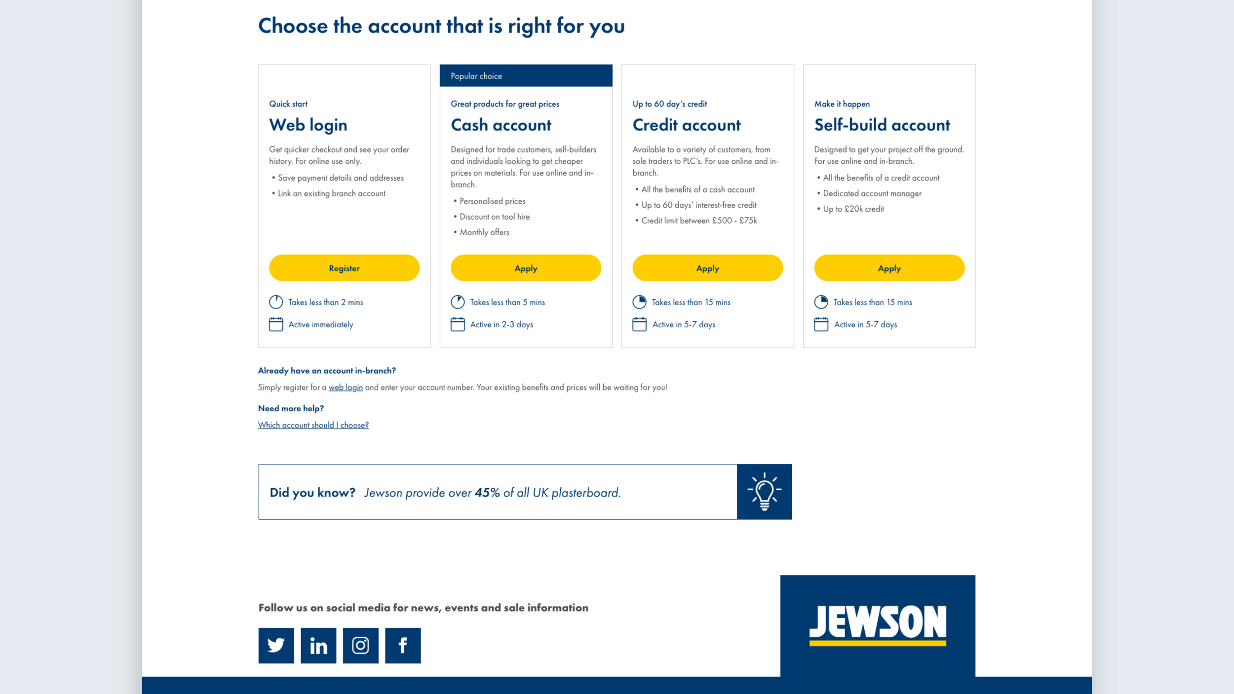
In Q3/4 2022, the UX Team was tasked with redesigning the digital onboarding experience to push the needle on decreasing Cash and Credit account applications. The process involved analysis of the journey as it was, both quantitative and qualitative, before mapping out potential new journeys to test and establish where development limits lay.
Through collaboration with User Researchers, UX designers, developers and the business stakeholders, the design I produced in the initiative resulted in a year-on-year uplift of 78% successful cash and 163% successful credit account applications online.
Problem discovery
Discussions with stakeholders and analysis of the existing journey identified key problems faced by potential customers, and highlighted the needs of the business.
Sign up seemed to have ended as soon as they had created their web login and land in their new account area.
Benefits of applying for cash or credit are ambiguous and hidden behind initial web login creation.
Forms contained an overwhelming amount of fields, many of which were optional or duplicates.
For the user:
Declining Cash and Credit applications was undermining attempts to balance online prices against the personalised, bartered prices received in branch.
As part of plans to phase out paper forms in branch (for environmental and security reasons), an improved digital journey needed to be functional for colleagues in branch.
For the business:
Journey mapping
Analysis of the existing journey’s data and user flow identified points where customers were dropping out of the funnel, most when they had created their login, but before they begun to apply for cash or credit. Discussions with backend development highlighted the need for the two processes to be separate. This led to the creation of two potential journeys to test with :
Without requiring technically heavy rebuilding of the entire system, we can keep users in their intended journey from the start by offering the choice of account before the login creation stage.
Option A:
Leaving the two journeys visually separate, we can redesign the successful login creation screen to provide clearer choices as to whether a user wants to further their account by applying for cash or credit.
Option B:

User testing
We conducted tests of prototypes of these two journeys with filtered participants online. We discovered that Option B still left many believing that the web login only was the best option for shopping online. However, Option A gave users confidence of the process as they were only asked to make a choice once.
Iterative design process
Iterative wireframes and designs, collaborating with stakeholders and development, exploring new ideas for business.

Final design
Performance to date
After running the new “Choose Account” page through A/B testing, and making tweaks per the results and business requests, the design I created launched onto the live site in Nov 2022. Following the launch, I collaborated once more with our Lead UX Designer and development team to further refine the forms, minimising excess fields throughout the Credit application process. I also reworked the account linking process, including the how-to in the accordions below the main account choices.
Data analytics have monitored the performance of all the online journeys in the months since launch. Now a year post-launch, the redesign has seen a staggering uplift of 78% successful cash account applications, and 163% successful credit account applications. Even the simple web login that was the defacto account previously has seen a 7% uplift in successful creations year-on-year.


